Case study: a minimal website for a freelance writer
Earlier this year, I ran a giant giveaway – offering up a free custom website to one lucky small business owner. After a few weeks of entries delighting at entries coming in from around the world, I opened up my random number generator to choose the winner. The person with the lucky number? The lovely and talented Giulia of Giulia Writes.

Giulia was looking for a new WordPress website to bring her writing work together to be housed under one roof. She wanted to showcase her freelance translation services whilst simultaneously growing her online community through her thoughtful blog which covers topics ranging from creativity to seeking a more minimal lifestyle. Trust me when I say it’s well worth a read.
It was important to Giulia that her website visitors feel calm, uplifted and inspired when browsing through her site so, together, we crafted a colour palette that encompassed that soothing feeling. Really, we created a look that would feel like home to her ideal audience.

Since writing really is the very essence of Giulia’s website, I created a design that really reflected that. By introducing the torn paper effect to the top of each page, it became clear to site visitors that this was a website focussed on writing and the power of words. As Giulia says herself:
“The power of language: whether speaking to yourself or others, the power of words and the narratives in our lives is all-encompassing, and I’m just tapping into that.”
The torn paper effect runs across all of the site pages, whilst the rest of the design reflects that sleek minimal feel. Block quotes are highlighted with a relaxed handwritten font, whilst Giulia’s photography is featured throughout as a homeage to her Instagram community.
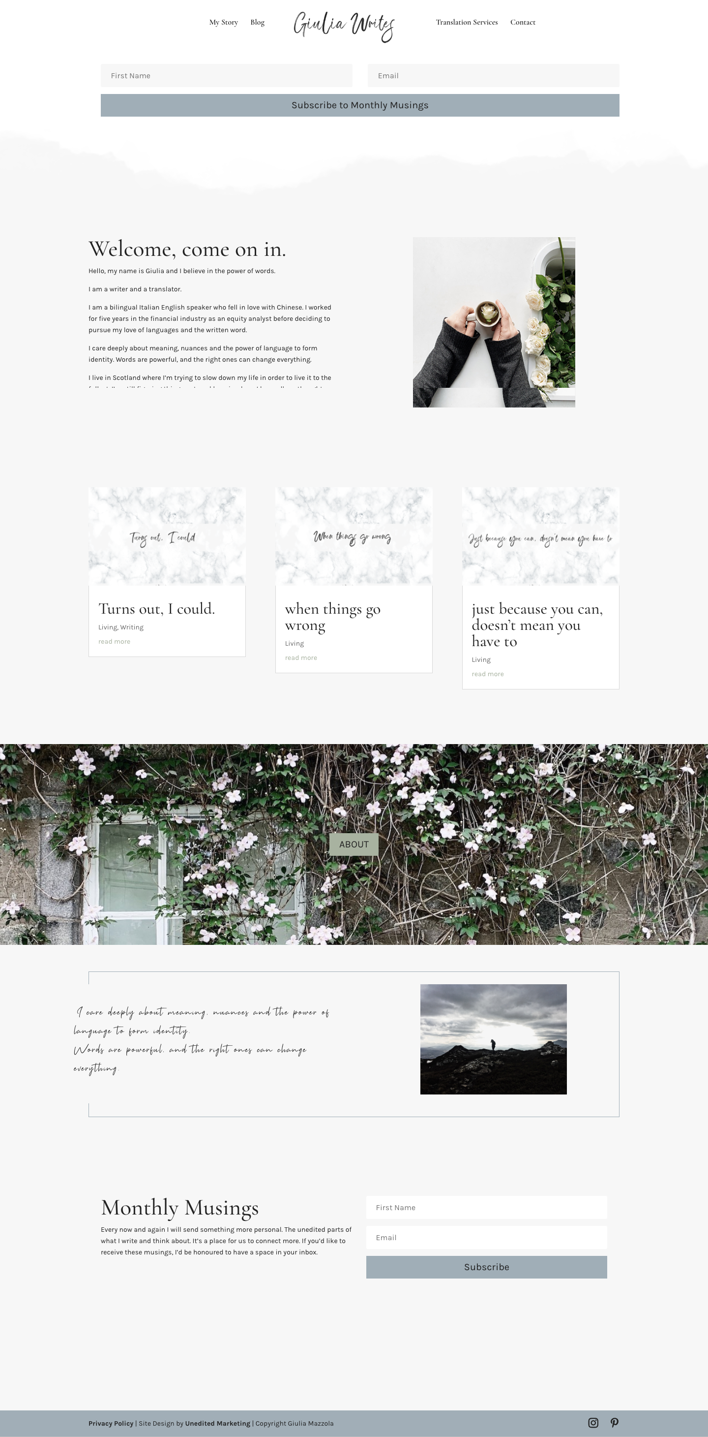
As Giulia is currently growing her newsletter community with ‘Monthly Musings’, we made this a key focus throughout the site. This is where the colour palette really came into play, helping call to actions stand out and act more as invitations, as opposed to overly aggressive demands to the website visitor.

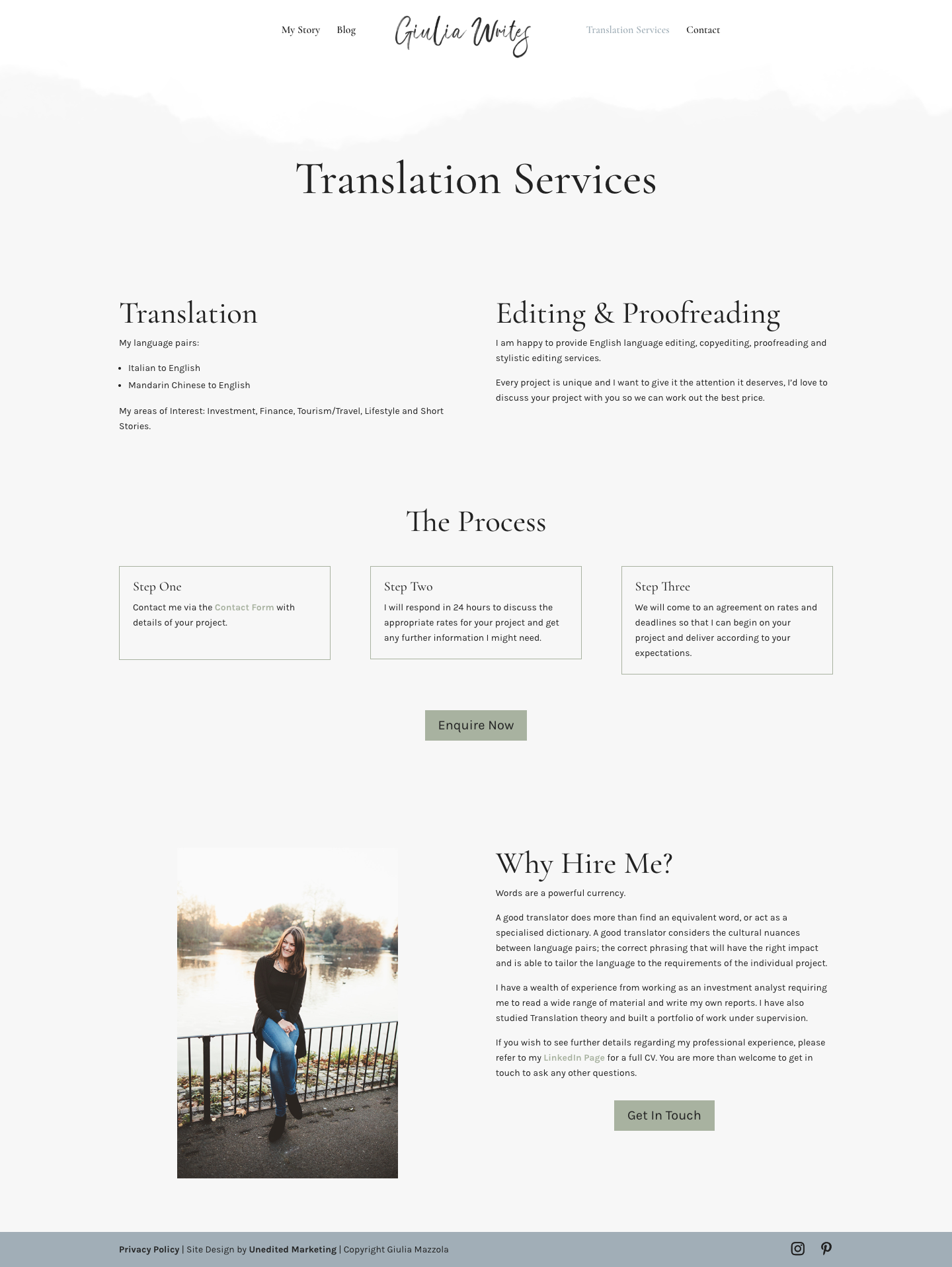
On the services page, we really focused on simplicity and clarity. After all, the whole idea of working with a freelance translator is to simplify your work so we made that very clear in the design.
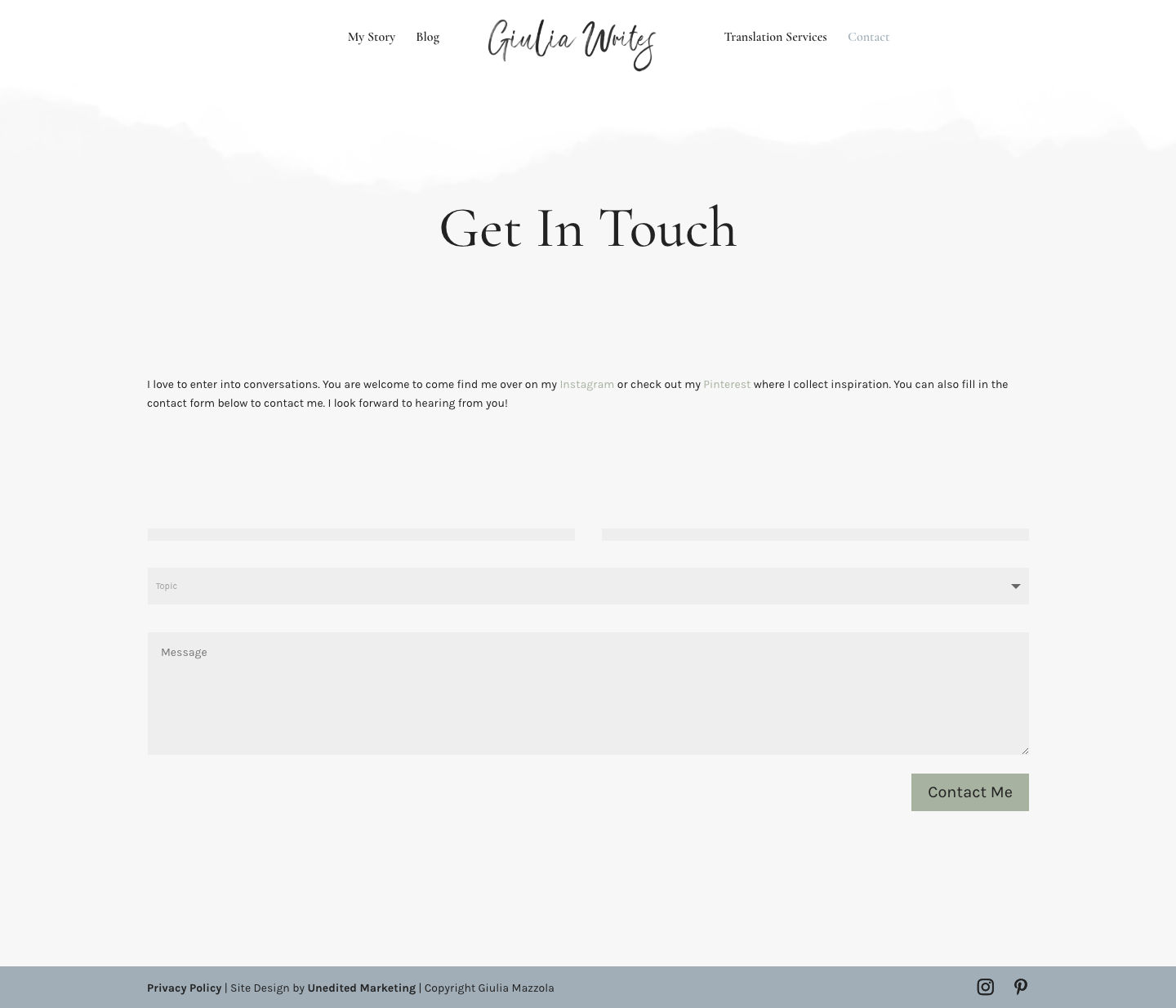
The boxes lay out the translation process whilst the invitation, to get in touch for a chat with Giulia, is reiterated throughout.
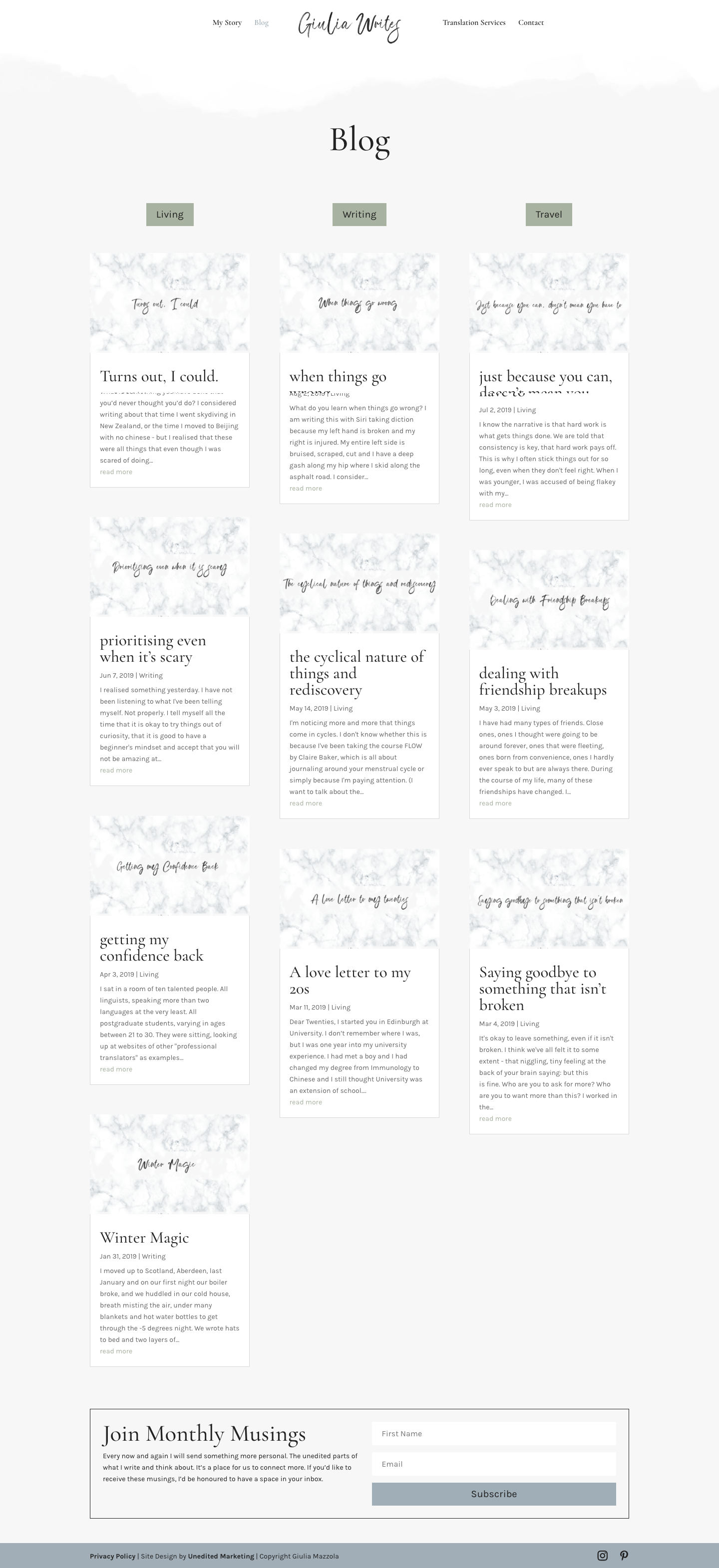
Finally, the blog page sets the theme for the conversation – living, writing and travel – with filters to explore by topic or browse the archives.
Write your website copy like a pro copywriter (without the pro price tag)
Introducing... the about page roadmap.
You’ll get access to the same copywriting framework I use with my small business clients. So you can have an about page that feels 100% you.
Pin for later:
